
The Pantone Color Institute has named the most fashionable colors of the spring-summer 2020 season. Experts presented two palettes: the main one, consisting of 12 shades, and the additional one, which includes 4 basic neutral colors.
The trendy colors of spring and summer 2020 look colorful and fresh, but at the same time a little familiar, reminding us of the bright and optimistic 80s. According to the Pantone Color Institute, this palette reflects our dream of stability and individuality, preserving traditions and updating classics.
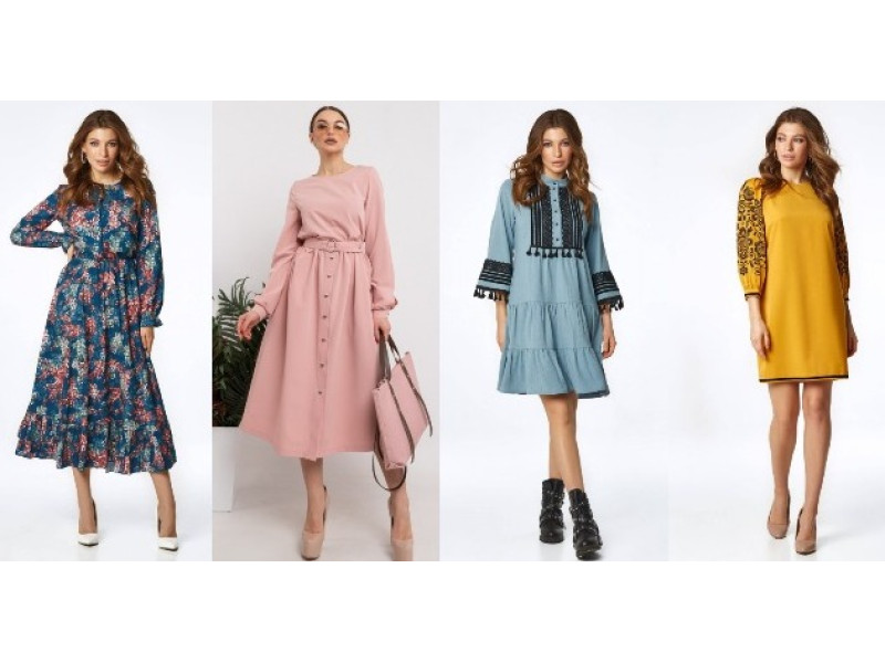
Everyone can find their favorite in this year's Pantone color report. Lovers of juicy shades will find fiery red Flame Scarlet, ochre yellow Saffron and no less stunning Orange Peel, which are perfectly combined with luxurious shades of blue - Classic Blue, Faded Denim, Mosaic Blue. The selection also includes two absolutely restrained green shades - Biscay Green and Chive.
Color of the Year 2020 – PANTONE 19-4052 Classic Blue
The new decade opens with a beautiful, calm shade of Classic Blue.

A deep, rich shade of blue that soothes, restores vitality, and opens up a world of possibilities. “Stable and reliable, this color is one that many people understand and use,” says Leatrice Eisman, executive director of the Pantone Color Institute. Rich and deep, Classic Blue evokes the endless and mysterious evening sky and the mysterious depths of the ocean.
This color is distinguished by its versatility and is announced as the new universal replacement for classic black. It fits very easily into the wardrobe as a basic color that many people like. Similarly, Classic Blue will be the perfect color for evening dresses and special occasion outfits.
PANTONE 18-1662 Flame Scarlet – Flame Red
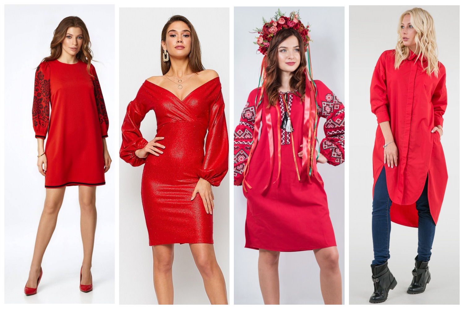
Fiery red – a bright, burning, unbridled shade embodies determination, courage and self-confidence. According to Eisman, this color boldly declares – I am here, pay attention to me. Decisive and energetic Flame Scarlet is the choice of bold fashionistas.
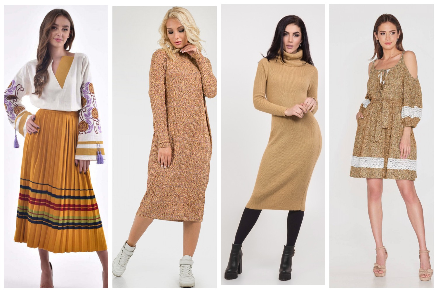
PANTONE 14-1064 Saffron - Saffron
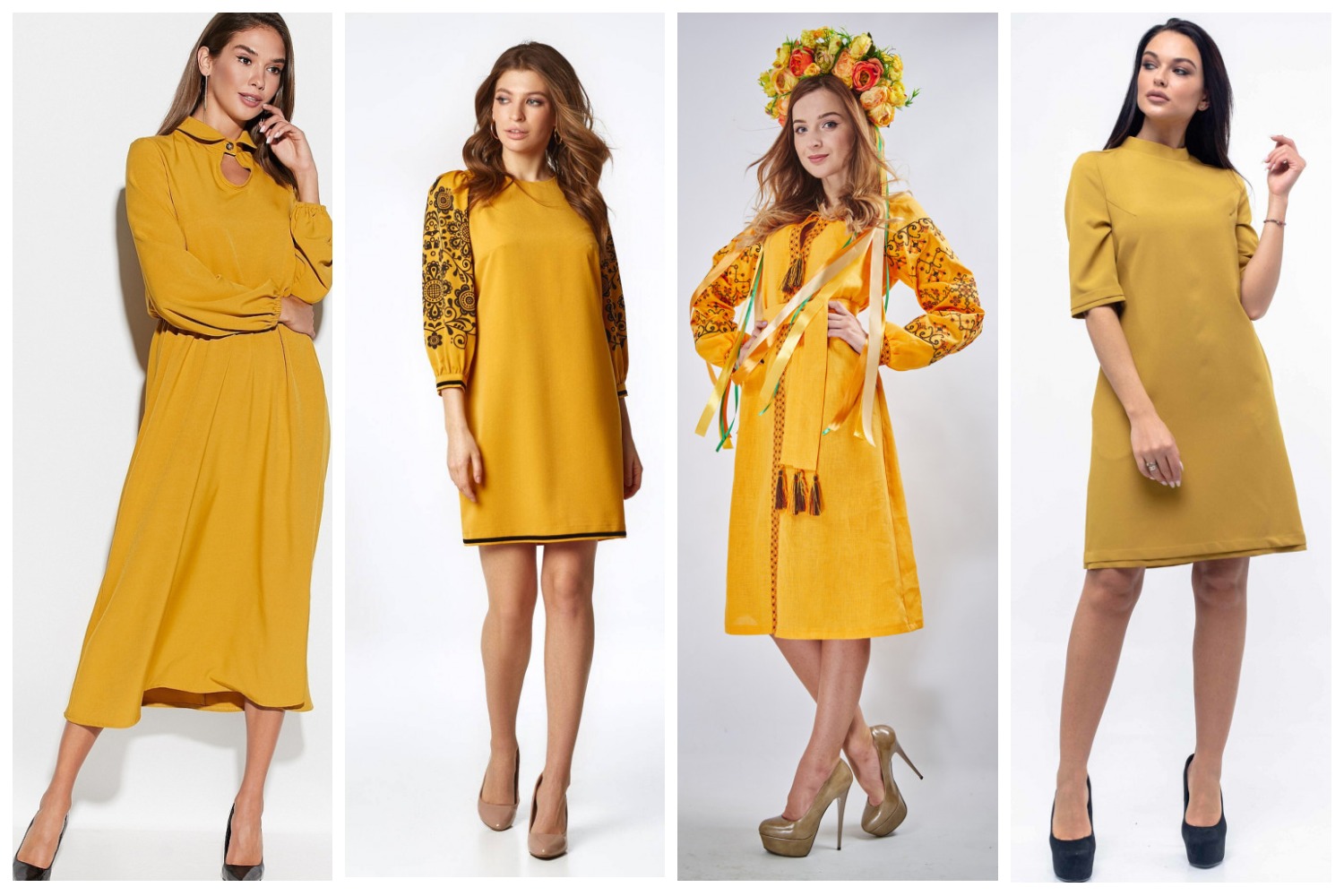
Spicy “Saffron” a very active shade of yellow-orange adds brightness to the fashionable palette of 2020. Perhaps the most cheerful color – amber-yellow Saffron adds piquancy and sharpness to the palette, like an exquisite and expensive spice. Shades of ocher and mustard were popular in past seasons, the trends of 2020 continue this trend.
PANTONE 15-5718 Biscay Green – Biscay Green
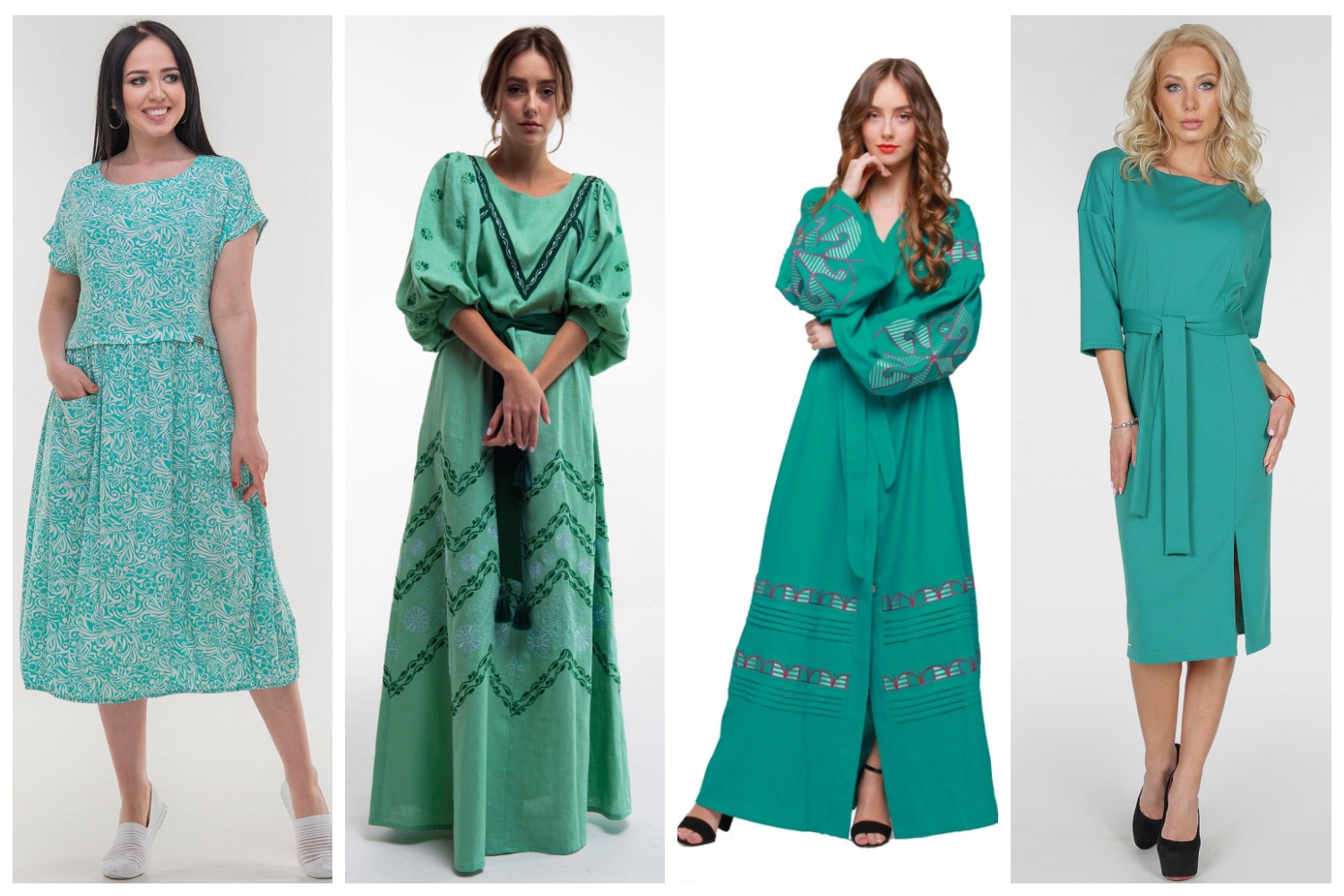
Biscay Green is a color that reminds us of the warm, clear waters of tropical beaches. The clean and refreshing aquamarine hue conjures up distant resorts in our imagination and invites us to “dive” into the clear waves to enjoy the coolness.
PANTONE 19-0323 Chive – Green onion
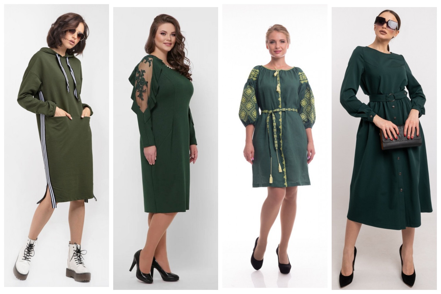
Nowadays, no one doubts that fresh greens are the key to a healthy diet. Pantone is sure that you are used to seeing this green color in the most original combinations, because the dark grassy green Chive perfectly supports the bright palette of 2020 and is ideally combined with any of its bright colors - like the leaves of plants with their flowers and fruits. The dense and rather dark shade of Chive symbolizes nature and restores balance and harmony.
PANTONE 17-4021 Faded Denim – Faded Denim
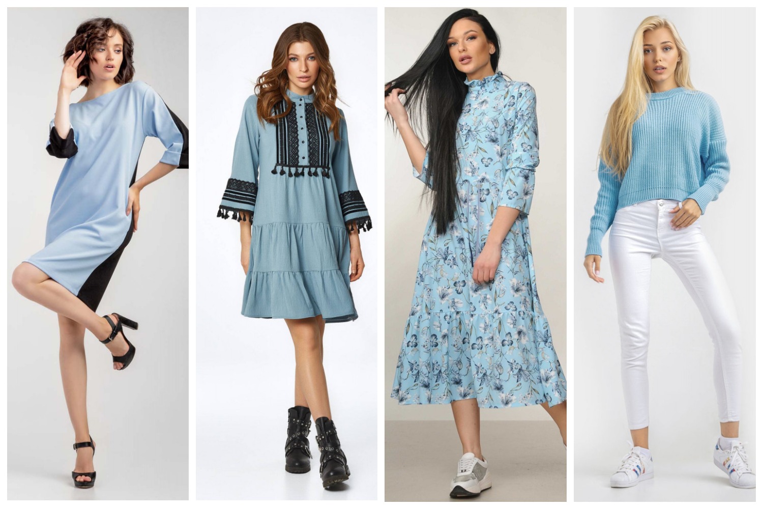
Faded Denim is a calm shade of blue that reflects comfort and confidence. Dark denim has been dethroned and replaced with Faded Denim blue. Eisman calls it a “super comfortable shade” and “not like a stiff new pair of jeans you just put on, but something you’ve washed a few times or have had for a long time.”
The faded and faded color actually speaks of reliability, comfort, and convenience – like your old favorite jeans that will never let you down. Any color goes well with Faded Denim, but contrasting Saffron or Fiery Red look especially impressive with it.
PANTONE 16-1359 Orange Peel – Orange Peel
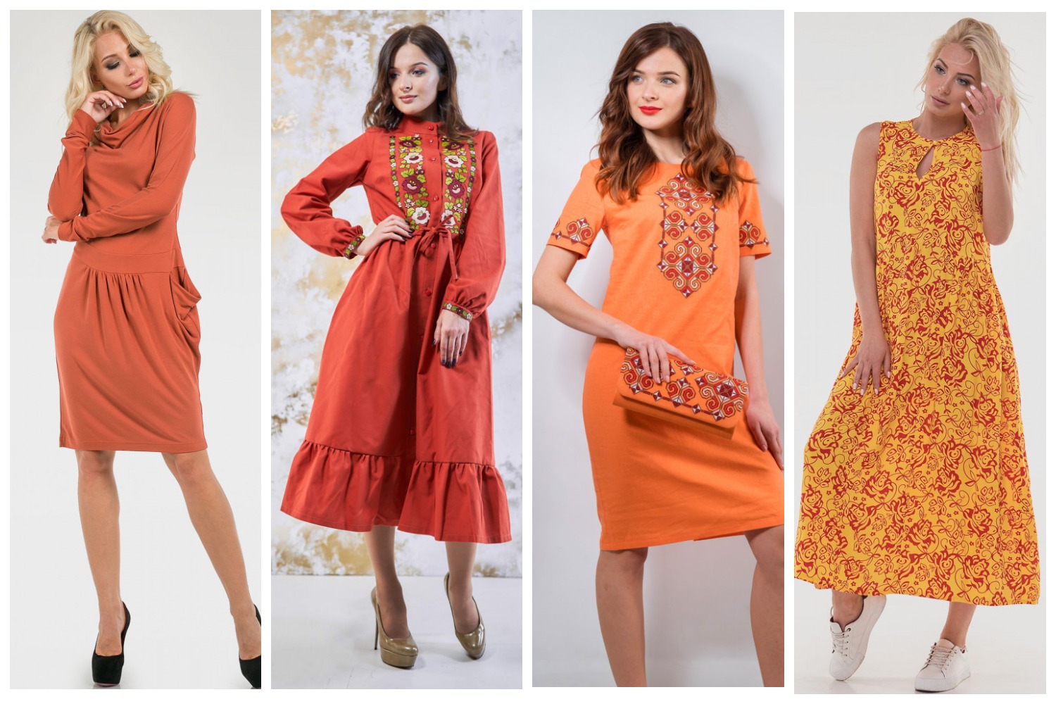
In the spring palette of fashionable colors, Pantone has offered a bright appetizing shade of Orange Peel. It is a little more saturated than Saffron, but just as soft and enveloping with warmth. Orange Peel looks juicy and very "tasty", adding piquancy and saturation to the color palette.
PANTONE 18-4528 Mosaic Blue – Blue mosaic

Mosaic Blue is another shade of blue in the 2020 fashion palette. Art connoisseurs say that this blue is one of Vincent Van Gogh's favorite shades, it can also be found on ancient tapestries. Graceful, sophisticated blue exudes mystery, grace and depth of feelings. The shade gives the color palette of the season not only coolness, but also intrigue, transporting us to Chefchaouen - the blue city in Morocco, to Portugal with its endless blue motifs in tiles and architecture or to Greece with blue roofs on ancient snow-white buildings.
PANTONE 13-0822 Sunlight – Sunlight
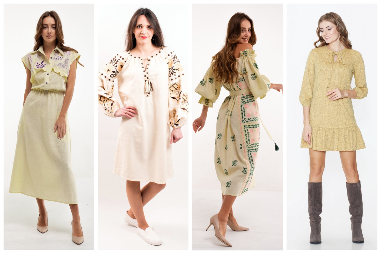
Delicate pastel yellow Sunlight gives a warm feeling of joy, fun and optimism of a sunny day. Very light, soft and gentle shade of yellow Sunlight – like a ray of sunshine. It will definitely lift your mood, make you smile and look at the world around you with different eyes.
PANTONE 14-1318 Coral Pink – Coral pink

The appearance in the Pantone palette Coral Pink owes its popularity to last year's Living Coral 2019. “Pantone experts know that the color of the year influences the fashionable colors of the next year. People experiment with color. They buy it, they like it, they don't want to lose it, ”said Eisman. Therefore, the gentle Coral Pink is a softer spring version of Living Coral, which wraps us in a warm, cozy embrace of soft color.
PANTONE 18-1345 Cinnamon Stick

The warm, spicy, and definitely very earthy shade of brown Cinnamon Stick is on the one hand very challenging. But it will help create unexpected color combinations with both cool colors and bright and pastel spring colors. Luxurious Cinnamon Stick reminds us of the color of an expensive brandy in a glass and a delicious cinnamon cake.
PANTONE 18-3513 Grape Compote
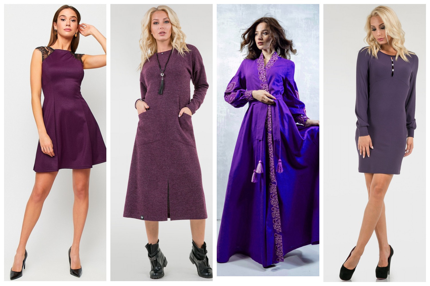
Rounding out the spring-summer 2020 color palette is Grape Compote. A soft yet rich shade of mystical purple that really does resemble the skin of ripe grapes. However, judging by the complexity of the shade, there could well be other fruits and berries in it besides grapes.
Basic color palette spring-summer 2020
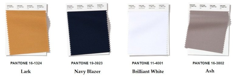
The explosion of color from the main palette is balanced and soothed by a selection of classic neutral shades for the Spring-Summer 2020 season. These include sophisticated, natural and versatile colors. They can be used alone or to create bright color contrasts.
PANTONE 16-1324 Lark – Lark
The luxurious shade Lark is a rather bright red shade that, at first glance, is not associated with basic neutral colors. But with imagination and courage, this is an excellent universal basic all-season color that many have loved. Remember, we have been wearing a similar color of shoes for many years, considering it absolutely classic.
PANTONE 19-3923 Navy Blazer – Navy Blazer
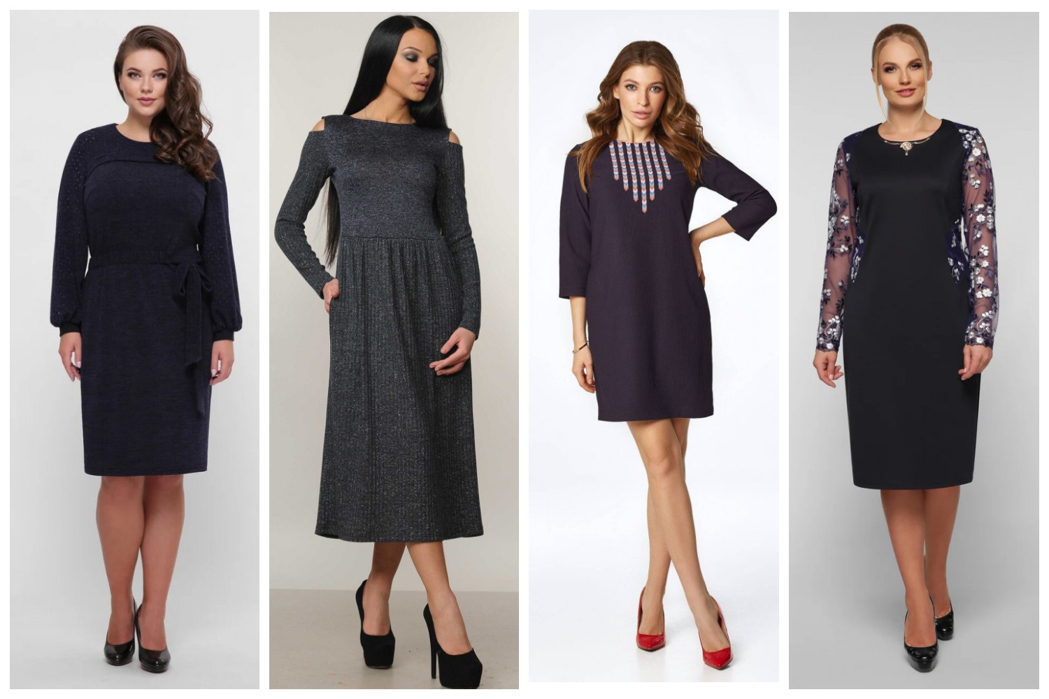
Such a dramatic dark blue, almost black Navy Blazer is always elegant and self-confident. Like a sailor jacket, it conveys stability, restraint and strength.
PANTONE 11-4001 Brilliant White – Brilliant white
Dazzling snow-white Brilliant White embodies simplicity, pristine purity and modernity. Fresh and clean, without impurities, Brilliant White declares that laconicism and simplicity are in fashion today.
PANTONE 16-3802 Ash

Strong and calm, a luxurious shade of ash – such a warm gray can settle in our wardrobe for a long time. Closing the top of the fashionable colors of the season, Ash – out of fashion and time – as a symbol of eternity and eternal values. In addition, it also goes well with bright shades – Saffron, Flame Scarlet, Orange Peel and Sunlight.
Write a comment